Got an e-commerce site? You surely know that your sales are a factor of the qualified traffic, multiplied by the conversion rate. I’d like to tell our own story, of what we identified as conversion rate killers and how we solved them.
Let’s assume that people will buy from you if:
- You sell what they need
- They discover your site and understand that you sell what they need
- They quickly understand the differences between your different offerings and find what’s best for them
- They understand what’s going to happen from the payment and until they receive your goods
We’ve moved our e-commerce system to WooCommerce, so my explanation focuses on it, but you can easily apply it to any other e-commerce platform you use.
Let’s skip the first part about selling what your clients need. This is a topic for a whole new discussion. I’m assuming that you know your clients and are preparing great products, just waiting to be bought.
1. Displaying your products and purchase options
If you use an e-commerce plugin (like WooCommerce), you know that there’s a ‘standard’ way to present your products. WooCommerce has a ‘shop’ page, which lists your products in a neat grid.
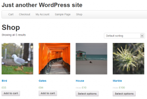
Is this the best way to present your business and products?
My advice is to forget about the default product displays. Think about the best way to present your products to visitors. Then, if you discover that the best way is that standard products grid, by all means, go for it.
Shameless plug: our WooCommerce Views plugin lets you create fully customized WooCommerce sites without the need to manually edit complex WooCommerce template files. You’ll be able to create your very own e-commerce sites, that utilize all the power of WooCommerce for order processing, but with your own design.
Do you know how many products we sell on wpml.org? Your first guess might be one product – WPML. A closer look will tell you that we sell three products. But the reality is, we sell a total of eight products on wpml.org. These include the three account options and five renewal and upgrade WooCommerce products. Of course, listing them all in a grid and letting clients choose between them wouldn’t work for us.
Our custom products display lists only relevant products. It displays them side by side and lets visitors compare between their features.
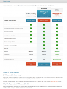
We discovered that this simplified listing helps potential clients understand exactly what they are going to get and highlights the differences between the account options.
Imagine yourself walking into an electronics shop, looking to buy a new gadget. You know what you need, but you haven’t made up your mind yet about the specific model. What would it take to get you to pull out your credit card and buy?
If you look at our purchase page, you will notice several elements which we found to be especially useful:
- General statement about WPML accounts and refunds policy
- A side-by-side comparison table
- Clear pricing and purchase buttons
- Answers to frequently asked questions
Of course, your site is different and your needs might be different too. My suggestion is to think about what your clients need to know. Then, build your store pages to answer these questions.
2. The checkout process
When I go to the supermarket, I get a list (carefully prepared by my wife) of everything that I need to buy. I grab a cart, stroll through the lanes, pick what I need and arrive at the register. I await my turn, scan the products and pay. Then, I load it all and get back home. BTW, do you also get trapped in the slowest line to the checkout? I always do. Anyway…
Our website, wpml.org, has very little in common with supermarkets. The only resemblance is that we sell something. So, why should our site look and feel like a supermarket?
We don’t have shoppers strolling to the sound of happy music, picking up products on sale, choosing the freshest lettuce and getting 10 granola bars for the price of 7. We just sell WPML.
I’m sure that you understand that every hurdle you put between your clients and the register will lead to less sales. So, let’s look at these hurdles and see how we can remove them.
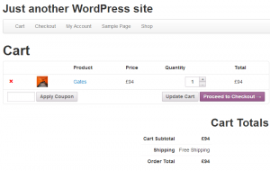
If your clients are likely to buy just one product, do you really need a cart? Of course not.
WooCommerce uses a cart system to allow building any sort of store. This is a good thing, but it doesn’t mean that you need to expose this functionality to your shoppers.
When visitors select a product from our purchase page, we run a small script that clears the cart and adds the product to it.
add_action('init', array($this, 'skip_cart'));

    function skip_cart(){
        // Skips the cart page. Redirect to the checkout page.
        if(isset($_GET['buy_now']) && $_GET['buy_now'] == '1'){
            global $woocommerce;
            $checkout_page_id = get_option('woocommerce_checkout_page_id');
            if(isset($_REQUEST['add-to-cart'])){
                $product_id    = intval($_REQUEST['add-to-cart']);
                $woocommerce->cart->empty_cart( $product_id );
                $woocommerce->cart->add_to_cart( $product_id );
            }
            wp_redirect (get_permalink($checkout_page_id, 'page', true));
            exit;
        }
    }
What this script does is:
- Check that it’s a click on one of the ‘buy’ links.
- Get the ID of the product we’re adding to the cart. This ID comes from the ‘buy’ link.
- Empty the cart, in case we selected a different product before.
- Add the new product to the cart.
- Redirect to the checkout page (skipping the cart page).
So, we don’t have a ‘cart’ page in our site. You select your product and arrive directly at the checkout page.
The next thing that we want to optimize is the checkout page. The standard WooCommerce checkout page is a big form. It lets visitors fill in their full details, including billing and shipping information.
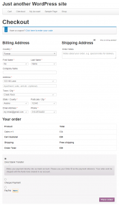
But wait. We don’t ship anything anywhere. Come to think about it, all we need is the client’s name and email. That’s what we’ll use to deliver the new WPML account. So, this is all we’re asking for. Remember? Less hurdles lead to more sales.
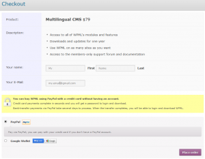
A closer look at our checkout page will also reveal a few gems that we learned are essential.
- A clear description of the product, a reminder for the price and complete details about what you’re getting
- Your essential details (name and email)
- Information about the payment process
- Choice of payment processors
That little yellow box in the middle of the page turned out to be very important for clients and our conversion rate. Here is what it says:
You can buy WPML using PayPal with a credit card without having an account.
Credit card payments complete in seconds and you will get a password to login and download.
Bank-transfer payments via PayPal take several days to process. When the transfer completes, you will be able to login and download WPML.
Simple, right? But clients really want to know that:
- Our ordering process is secure (it doesn’t say so in words, but there’s a lock image)
- You don’t need to open any account anywhere to buy from us
- Credit card orders complete instantly and wire-transfer payments take a few days
Less doubts, more sales.
Epilogue – Where are our five other products?
Earlier I mentioned we have eight products to sell, but our purchase page only lists three.
The other products that we offer are renewals and upgrades.
We want to sell these too, very much. So we make it easy for people to find the upgrade and renewal and buy them.
If there’s an upgrade available, we show it on the account page. The button is clear and noticeable, but not disturbing. It’s there for the convenience of our clients, not to nag them.
The upgrade message tells clients what they receive once they upgrade and how this will help them. There’s also a dismiss option, so that clients can get it out of their way, if it’s not relevant.
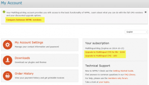
When clicking on that upgrade button, we display a comparison table, showing the differences between the upgrade options.
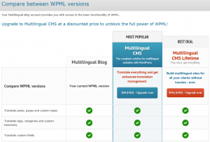
Again, we make this information relevant, so that clients can easily see the differences between the options and choose what best for them. We believe that if we help clients find the best match for their needs, they will be happy and we will be happy. So far, it’s working great.
Going multilingual?
You can apply the same techniques for your multilingual e-commerce sites. For multilingual sites with WPML and WooCommerce, look no further than WPML Multilingual & Multicurrency for WooCommerce, which comes included when you buy the Multilingual CMS package.

