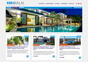
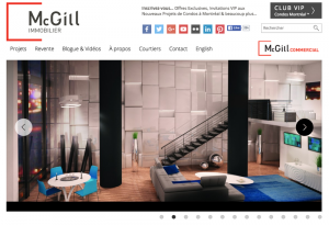
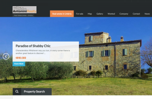
At first glance, they all look similar: tons of pictures with properties, a handy search, and maps. Today’s real estate websites are responsive and attractive. Some convert visitors into clients better than others, but what exactly makes a real estate website successful?
We interviewed three WordPress developers from different parts of the world who built successful multilingual real estate websites. Continue reading to know how to build such successful websites.
The projects and authors
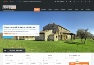 |
Website: antonini-realty.com Location: Umbria, Italy Languages: Italian, English, Dutch Properties: Mainly historical buildings Number of properties: 200+ WordPress theme: Real Homes Number of people working on the project: 2
|
||
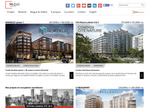 |
Website: mcgillimmobilier.com Location: Montreal, Canada Languages: French, English Properties: Condos Number of properties: 5000+ WordPress theme: A theme built from scratch People working on the project: 4
|
||
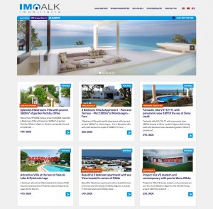 |
Website: imoalk.com Location: Portugal Languages: Portuguese, English, French Properties: Houses along the coast Number of properties: 400+ WordPress theme: A Toolset theme People working on the project: 1
|
Rule number one: Develop customer interest
Before you get your hands dirty implementing a real estate website you need to understand the site’s purpose. Don’t for a minute think that building a real estate website comes down to putting properties on display and providing a good search.

The goal of a real estate site is to generate leads. Lead generation is the initiation of consumer interest or inquiry into products or services your business offers. If you want to build a successful real estate website, you need to provide stuff that will pique a customer’s interest. Interest in the site itself or in a specific offer, this would be the first step. The next one is to encourage the customer to take the desired action.
What are these actions? Let’s find out from our interviewees.
Rule number two: Get the best pictures you can
Attractive pictures won’t be your secret weapon. In the real estate business, it’s a necessity. The competition in the market is huge. If you don’t impress your visitors in a few seconds they will leave your site and go to your competitors.
Caroline van Agteren, a real estate agent from Antonini Really agency in Italy, confirms that. When asked what is a must-have for a real estate site to be successful, she explains:
“Pictures! Now everything is very visual. We get compliments on our photo work. In the end, the looks determine whether someone falls in love with a property.”
Indeed, the pictures on Caroline’s site are beautiful:
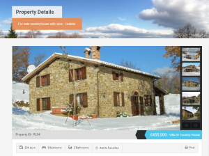 Source: http://antonini-realty.com/ – Real Estate broker in Italy, Umbria |
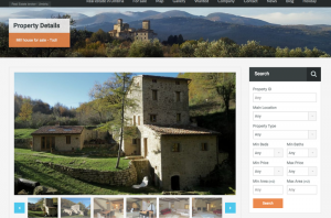 |
If a property doesn’t meet specific criteria, it won’t be accepted.
“They have to be nice, charming, appealing, but can be a total ruin, .”
says Caroline.
Featuring the best properties
Although all three websites we present here are based on different WordPress themes, there is an interesting “coincidence” in their homepage layout.
First of all, each of the three sites has a big slider in the “above the fold” section.
The best pictures have been put in sliders to impress the visitors and keep them on the site.
Slightly below the slider, there comes a showcase of featured properties. Again, each of the websites includes such a showcase. Another “coincidence”? No way.
Our second interview Ildar Khakimov from Canada, co-author of the mcgillimmobilier.com, comments: “Our homepage is a showcase of our best properties. We present our best offerings with big beautiful pictures and just enough text to entice the visitor to click to learn more”. Here’s an example:
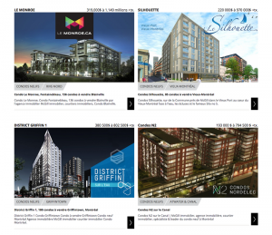
“… entice the visitor to click more” – wisely summarized. In these words, Ildar also included the first call to action that has been planned for a prospect: to go to another page. This will be a single property page where there is much more space to present details.
Caroline adds “Accurate information is the key to selling. After a picture lures a client in, they need detailed information to understand what they are looking at.”
Rule number three: Provide easy navigation leading to the contact person
No doubt accurate information about a property matters, but first your prospect needs to look up a property that suits them. To make this happen, you need to equip your site with a good search engine and navigation.
“Ease of navigation that allows visitors to find properties they’re interested in and clean design that doesn’t distract people” were the first two requirements Ildar listed when asked about the project must-haves.
“We spent a lot of time around navigation and search, many versions were tried before we settled on the one that we’re using today.” says Ildar.
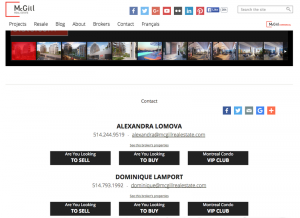
However, at the end of the day, your business goal is to make the prospect contact the agency. Here’s space for including another call to action.
No wonder that all three sites have another thing in common: each single-property page ends with contact information encouraging the visitor to contact the agency.
This requirement was also shortlisted on Ildar’s must-haves for the project:
“Comprehensive navigation, so a person can jump onto a specific agent’s page right from the property and see other properties sold by the same agent.”
Pick a random property on their site, scroll down the page and you will see contact information for the agent.
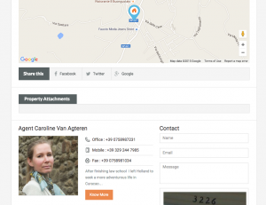
The same happens when you visit Caroline’s site.
She explains: “Business and agent information are needed for those who are looking for assistance”. She adds that it also helps to create their own identity.
Collect your contact data
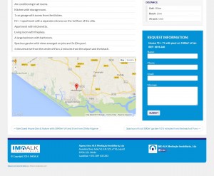
In his imoalk.com site, Antonio Almeida connected a contact form with a property.
The contact form allows a visitor to contact the agency for details about this particular property and, in addition, collect and store the contact information together with the property in your WordPress database.
So the agency not only receives the emails but can also access all collected contacts in the WordPress back-end. Being combined with properties it’s also a great source for statistics.
The interesting part is that Antonio implemented this without using PHP, visit the case study to see details.
Rule number four: Reach a wider audience
So you have nice pictures of properties, clean navigation, a good search, and smart calls to actions designed. Is this enough to succeed in the real estate business?
Note that we described all the real estate site’s essentials with one silent assumption. The customer visited the site. But how can we be sure that there will be any visitors? All the carefully designed facilities are worth nothing if only few people visit your website.
Your next goal is to make the website attract traffic.

The problem is that your competitors realize it too and will do the same. So you need to come up with something extra. Translating the site to foreign languages seemed to be a perfect option.
Caroline explains:
“We regard a multilingual site essential in this world. Clients no longer come to Italy and walk into your office to ask you whether you would like to sell them a house. They all hunt on the internet and mostly only contact you to organize the actual viewing. As there are many agencies out there we have to be pro-active and prepared.”
Now their site is available in three languages.
“Being in Italy, Italian is obvious, English is essential, Dutch since both I and one of my colleagues were born in Holland so our native language is Dutch. We would like to add more languages but are hesitant to do so without having a native speaker on board.”
“The amount of work to translate everything” was listed as one of the biggest challenges in Caroline’s project. She explains:
“Certain words do not simply exist in another language or are hard to translate in one word, it takes the additional language as a whole to make it clear what it is all about.”
However, if something seems to be challenging for you there’s a good chance it will be tricky for your competitors as well. Why not use the difficulties as an opportunity to make your offer stand out?
Providing the contents in different languages has paid off. The Antonini Reality site attracted customers from Australia, Sweden, the US, and Belgium. “They really are from all over the place,” says Caroline.

Presenting his site in three different languages was an obvious decision for Antonio. He used WPML on a number of different sites he built. imoalk.com is available in Portuguese, French, and English.
Ildar’s site was no exception. Currently, his site is available in two languages French and English and they plan to add more:
“We’re in a French-speaking province Quebec which is part of the English-speaking Canada. Most definitely, we would be missing out on a large part of the market if we didn’t translate the site in English, we’re also working on more languages.”
All our interviewees find working with WPML easy and they translated all the site’s elements into different languages. If you need some technical details, visit Antonio’s case study.
Rule number five: Get ready for challenges, it’s normal
Challenges in the process of building a real estate website are inevitable. They will vary depending on the size of your project, the tools and resources you have, including people involved, their skills, and experience.
The good news is that the solutions to overcome the obstacles are out there. Here are some problems our interviewees faced.
Finding a good web designer
For Caroline, the biggest challenge in the project was to find a good web designer. By “web designer” she has a WordPress techie in mind, not a graphic designer. Eventually, the theme they used was a ready-to-use stock theme dedicated to a real estate website. They picked it because of its look and aimed at adjusting it to their needs.
They needed a WordPress expert to get started with on the technical part, including the WPML setup.
“After a while when the basics were done, I had spent some time with him to solve various problems. It did not seem too complicated and I basically took over…”
Caroline comments. She proves that when you really want to you can overcome the obstacles you may face:
“… It took some trial and error but by now I know how to do all we need. I have no previous experience but am an entrepreneur and will do anything if needed for my company, within bounds of it being realistic and not a total waste of time.”

Finding a good web designer was important for Ildar too. They needed a typical graphic designer tough. They, as WordPress developers, could manage everything else. To find a great web designer they announced a sort of competition and picked the best one:
“We had several submissions then went with the designer we liked the most and that designer built out the rest of the pages”
Custom search engine
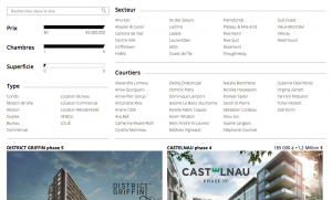
The biggest challenge Ildar’s team was facing was building a good search engine. Ildar’s site includes more than 5000+ properties.
“Every 4th new condo is sold through McGill Immobilier,” says Ildar, so implementing a flexible search engine wasn’t a trivial thing. They wanted to “ensure that the visitors were 100% satisfied with the experience” so it took them several trials to determine the best one.
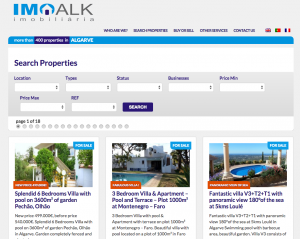
Surprisingly, building the search prototype turned out to be a piece of cake for Antonio. He used the Views plugin to handle it. The Views plugin he used is famous for its support of the Parametric Search feature that lets you create a powerful parametric search without using PHP.
Final thoughts
It doesn’t matter if you build a real estate site or any other WordPress based site. At the end of the day, there will always be something you would like to do differently and better.
Ildar’s team tried many versions for their search before they settled on the one they use today. When closing the interview, Antonio was still working on some enhancements. Caroline admits that it’s pretty likely that their site will look slightly different in another 6 weeks:
“We like to criticize ourselves in every possible way to be ahead of others doing so, so we are not often completely satisfied. Even right now we would like to add this, remove that, change this, etc..”
Nevertheless, all our interviewees were so proud of their projects that they decided to submit them to our WPML showcase. And most importantly, they can see other opportunities in having a nice multilingual website. Caroline summarizes:
“Working with WPML and multilingual sites is good for our own development, for our image, our employees, and business. It does motivate our team a lot to have an international approach and image, and a happy team is good for business. They need the right tools to work with and a WPML supported site is one of them.
I don’t know how anything could function without it to be honest. That would really mean going back to the dark ages…”


