This thread is resolved. Here is a description of the problem and solution.
Problem:
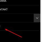
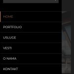
The client is experiencing an issue where the drop-down language switcher in the main menu has bad CSS and does not appear as expected.
Solution:
We recommend applying custom CSS to adjust the appearance of the WPML language switcher dropdown. You can add the following CSS code to the custom CSS section of your theme to make the language switcher align better with your site's design:
.wpml-ls-item ul.sub-menu {<br /> margin-top: -50px;<br /> min-width: 78px !important;<br />}Please note that this solution involves customization that might not be supported in the future due to potential changes in the theme or WPML code. If this solution does not resolve your issue or if it becomes irrelevant due to updates, we highly recommend checking related known issues at https://wpml.org/known-issues/, verifying the version of the permanent fix, and confirming that you have installed the latest versions of themes and plugins. If further assistance is needed, please open a new support ticket at WPML support forum.
This is the technical support forum for WPML - the multilingual WordPress plugin.
Everyone can read, but only WPML clients can post here. WPML team is replying on the forum 6 days per week, 22 hours per day.
This topic contains 5 replies, has 0 voices.
Last updated by 1 year, 1 month ago.
Assisted by: Noman.

