Skip Navigation

This thread is resolved. Here is a description of the problem and solution.

Problem:
You are experiencing issues with the new ATE redesign where the hover-line colors for translation fields are uniform, making it difficult to distinguish between automatically translated fields and those approved for translation. Previously, these were indicated by different colors which matched the progress bar at the bottom of the ATE window.
Solution:
We have updated the Advanced Translation Editor to address this issue. The color meanings are now as follows:
- Blue: Translated fields
- Dotted blue: Translated by automatic translation, might need review
- Solid blue: Translated either by the translator or from translation memory
- Yellow: Draft
- Light grey in Gen3 (black in Gen2): Not translated
We have removed the purple color, which indicated changes not saved on the ATE server, as we now autosave every time the user changes focus.

If this solution does not resolve your issue, or if it seems outdated or irrelevant to your case, we recommend opening a new support ticket. We also highly recommend checking related known issues at https://wpml.org/known-issues/, verifying the version of the permanent fix, and confirming that you have installed the latest versions of themes and plugins. For further assistance, please visit our support forum at https://wpml.org/forums/forum/english-support/.

This is the technical support forum for WPML - the multilingual WordPress plugin.

Everyone can read, but only WPML clients can post here. WPML team is replying on the forum 6 days per week, 22 hours per day.

This topic contains 2 replies, has 3 voices.

Last updated by Lucas Vidal de Andrade 1 month, 2 weeks ago.

Assisted by: Lucas Vidal de Andrade.

Author Posts
November 1, 2023 at 9:28 pm #14711367

Chainalysis

Tell us what you are trying to do?

hidden link

The ATE website used to show a bright green indicator lines -- the ".hover-line" <div> elements -- next to fields that were approved for translation, and a darker blue color for fields that were automatically translated but not approved yet.

These colors matched the progress indicator bar at the bottom of the ATE window -- the ".colored-progress-container" <div> element on the page.

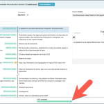
But with the new ATE redesign, the hover-line colors all look the same -- please see the attached image -- and it's virtually impossible to identify which fields were created through automatic translation.

Could you please restore the old colors so that the green and blue hover line colors match the progress container colors, to make it easy to determine which items were automatically translated at a glance, so that we can pay special attention to these fields when we review automatic translations?

Right now, this color issue is making it difficult to see what needs attention, and this is slowing down our translation reviewers' work.

automatic-translation-color.png
November 2, 2023 at 10:47 am #14715439

Marcel
Supporter

Languages: English (English ) German (Deutsch )

Timezone: Europe/Madrid (GMT+01:00)

Hi,

thanks for reaching out to us.

I wanted to let you know that we have received your report and our developers are already working on resolving the issue. We will update you once we have feedback.

Best Regards,
Marcel

October 1, 2024 at 5:03 pm #16242237

Lucas Vidal de Andrade
Supporter

Languages: English (English ) Spanish (Español ) German (Deutsch ) Portuguese (Brazil) (Português )

Timezone: America/Sao_Paulo (GMT-03:00)

Hey there,

Sorry for the (very) late reply. We updated the Advanced Translation Editor.

The meanings should be as follows:

1. blue == translated (somehow)
1.1 dotted blue: translated by automatic translation, might need review
1.2 solid blue: translated either by the translator or from translation
memory (which means the same translation was already used before)
2. yellow == draft
3. light grey in Gen3 (but it is black in Gen2) == not translated

We've completely removed purple, which was representing changes not saved on the ATE server yet, because now we autosave every time the user changes focus. The problem you were facing should be gone by now.