Skip Navigation

This thread is resolved. Here is a description of the problem and solution.

Problem:
The client is trying to reduce the space between flags in the dropdown menu of the language switcher.

Solution:
If you're experiencing excessive space between flags in your language switcher's dropdown menu, we recommend trying the following CSS code. Navigate to Appearance > Customizer > Custom CSS and add:

.wpml-ls-menu-item ul.sub-menu a {padding-top: 0px !important; padding-bottom: 0px !important;}

This code should remove the padding from the top and bottom of the flags, bringing them closer together. For more information on how to use CSS and the padding property, you can visit https://www.w3schools.com/css/css_padding.asp.

Please note that the solution provided might not be relevant to your case, as it could be outdated or not applicable to your specific situation. If this solution does not resolve your issue, we highly recommend checking related known issues at https://wpml.org/known-issues/, verifying the version of the permanent fix, and confirming that you have installed the latest versions of themes and plugins. If you still need assistance, please do not hesitate to open a new support ticket with us.

This is the technical support forum for WPML - the multilingual WordPress plugin.

Everyone can read, but only WPML clients can post here. WPML team is replying on the forum 6 days per week, 22 hours per day.

Tagged: 

This topic contains 9 replies, has 2 voices.

Last updated by Mihai Apetrei 8 months ago.

Assisted by: Mihai Apetrei.

Author Posts
March 21, 2024 at 11:31 am #15435962

annikaN-2

Tell us what you are trying to do? reduce space in between flags in the menu

Is there any documentation that you are following? Looked in yours and searched on google

Is there a similar example that we can see? hidden link on the top meny

What is the link to your site? hidden link

March 21, 2024 at 11:36 am #15435983

Mihai Apetrei
Supporter

Languages: English (English )

Timezone: Europe/Bucharest (GMT+02:00)

Hi there.

They are currently spaced even due to the styling of the theme or any custom code that was added on the site - practically, the space between the two flags is the same space that exists between the other buttons in the menu.

To overwrite that behavior, please go to Appearance > Customizer > Custom CSS > Add the following code and save:


.wpml-ls-current-language {
    margin-right: 0px !important;
}

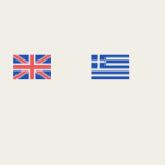
That should work and you can check the two screenshots below so that you can see how they look at the moment and how will our code make them look.

I hope that you will find this information helpful. 🙂

Mihai Apetrei

Screenshot 2024-03-21 at 13.34.09.png
Screenshot 2024-03-21 at 13.34.05.png
March 24, 2024 at 8:37 am #15443635

annikaN-2

Thank you for your answer and didn't recieve an email so thought you hadn't answer yet.
It's for a dropdown meny and the flags have a lot of space vertical but now I redid a lot of things so have not succeded to put more than 1 language but maybe you anyway can give me a css code for that?

Thanks,
Annika

March 24, 2024 at 9:30 pm #15444416

Mihai Apetrei
Supporter

Languages: English (English )

Timezone: Europe/Bucharest (GMT+02:00)

Hi Annika.

If you can share the page with me so that I can see the vertical (dropdown) language switcher, I will be happy to take a look.

March 25, 2024 at 10:50 am #15445884

annikaN-2

Thank you and here is a link, it's under construction but anyway you see the flags hidden link

Have a nice week,
Annika

March 25, 2024 at 4:15 pm #15447891

Mihai Apetrei
Supporter

Languages: English (English )

Timezone: Europe/Bucharest (GMT+02:00)

Hi Annika.

Sorry, but I do not see any flags.

I see only what you see in my screenshot and a full image background.

Also, initially, this URL was shared in this ticket:
hidden link

I did not know that we are talking about a totally different URL (hidden link).

Screenshot 2024-03-25 at 18.09.04.png
March 25, 2024 at 4:20 pm #15447911

annikaN-2

Sorry gave you the wrong lin hidden link

March 26, 2024 at 11:19 pm #15453226

Mihai Apetrei
Supporter

Languages: English (English )

Timezone: Europe/Bucharest (GMT+02:00)

Thank you.

Please try this CSS:


.wpml-ls-menu-item ul.sub-menu {
    max-width: 60px !important;
}

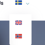
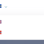
I'm adding a before and after images below.

Screenshot 2024-03-27 at 01.18.12.png
Screenshot 2024-03-27 at 01.11.45.png
March 27, 2024 at 6:56 am #15453637

annikaN-2

Thank you but this was not my issue, I wanted the flags in the drop down menu to be closer to each other.

Sorry for the confusion,
Annika

March 28, 2024 at 10:07 pm #15462695

Mihai Apetrei
Supporter

Languages: English (English )

Timezone: Europe/Bucharest (GMT+02:00)

No worries, Annika.

You can then use something like this:


.wpml-ls-menu-item ul.sub-menu a {padding-top: 0px !important;padding-bottom: 0px !important;}

That should remove the padding from the top and bottom and should bring them closer together.

You can learn more about how to use CSS and the padding property here:
hidden link

Mihai

March 29, 2024 at 6:07 am #15463040

annikaN-2

Thank you very much for your patience